|
| |
Released At :
BCC Party #10
Achievements :
C64 Graphics Competition at BCC Party #10 : #5
Credits :
Download :
Look for downloads on external sites:
Pokefinder.org
User Comment
Submitted by daison on 15 May 2016
| It's just standing there begging to be used in a demo part of some sort. Would be cool! |
User Comment
Submitted by The Phantom on 1 March 2016
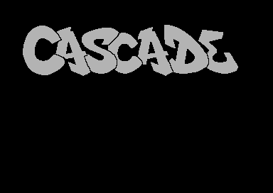
One of my BEST logo drawing styles is in "graffiti" style.
While I find this logo a bit bland, I found myself staring at it deeply, wondering what colors would look good through it.
Mission accomplished :) |
User Comment
Submitted by Dr.j on 1 March 2016
| Zeldin pls take it more easy :) i am sure Monte Carlos maybe didn't understand you and didn't made more touch on it (again i don't know just assuming) anyway: i like this version :) simple clean and tidy! |
User Comment
Submitted by Scarzix on 1 March 2016
I would love to see the final outcome of this sketch. It has that graphitti style we all loved back then.
if it was me and I could, I would add some psudo 3D depth to the chars and make it a really awesome logo.
let me know if you ever make it into a final logo (PM me if you need a tune for a demo part with this logo) |
User Comment
Submitted by Mr. Lee on 29 February 2016
| @Zeldin: I hope you'll finish it. And I also hope that Monte will Carlos some part on it... |
User Comment
Submitted by Zierliches Püppchen on 29 February 2016
| Looks unfinished, what happens? The Outlines are promising |
User Comment
Submitted by TheRyk on 28 February 2016
zeldin no need to apologize, sorry you're mad, but there must have been some misunderstanding between you and Monte who handed it in and thought it was okay.
No need for hard feelings imho, I like this logo and look forward to seeing the release when it will be usedh |
User Comment
Submitted by Digger on 28 February 2016
| @Zeldin: I don't necessarily think the pattern would improve this very neat logo! Sometimes less is more :-) |
User Comment
Submitted by iAN CooG on 28 February 2016
User Comment
Submitted by Zeldin on 28 February 2016
| Sigh... I am really very unhappy, not to say upset, that something like this has sneaked out! It's only a simple sketch. A test pattern, put together to work with. It was given to Monte Carlos, so he had some pixels to play with in a demo part he was planning to do. It was not ment to be released like this and for sure not as an entry in a compo. Please regard this, as what it actually is: workstep 1 of something, that was supposed to be framed one day... or not... Sorry to everyone, who feels annoyed by this piece :-/ |
|
|
|
 | Search CSDb |
|
 | Navigate |  |
|
 | Detailed Info |  |
|
 | Fun Stuff |  |
· Goofs
· Hidden Parts
· Trivia
|
|
 | Forum |  |
|
 | Support CSDb |  |
|
 |  |
|


