|
| |
Credits :
Download :
Look for downloads on external sites:
Pokefinder.org
User Comment
Submitted by Digger on 25 December 2021
| Fabulous AFLI and what JackAsser & HCL said. Would be interesting to try to make a game in AFLI. Probably a logical/blocky one. Or Boulder Dash alike in AGSPed AFLI :D |
User Comment
Submitted by KAL_123 on 27 May 2021
| Fantastic looking picture. Looks like it would have hundreds of colors. |
User Comment
Submitted by slimeysmine on 25 November 2016
User Comment
Submitted by Moloch on 20 November 2016
Fantastic piece of work by Mermaid. Love the adventurous mice and happy treants. <3
If you want to rant at each other open a thread in the forums. |
User Comment
Submitted by Tom-Cat on 20 November 2016
| This looks great in winvice BUT when viewed on a real c64 and CRT it looks amazing. Better than most amiga pictures, all the colours and detail, just perfection. 12/10 ! |
User Comment
Submitted by PAL on 20 November 2016
| If this could only have been a gfx in a legendary screen in a game back in the days... well it would be legendary... and while it is not that... it is legendary also now... Extreemely well crafted qute image... looks absolutely fantastix! |
User Comment
Submitted by redcrab on 19 November 2016
Absolutely fantabulous! This really makes me inspired to learn hires for real and possibly try afli one day. Congrats to the achievement of "a milestone in c64 gfx"
@Leon: I totally respect whatever you think of this piece, but I cannot understand what you mean here:
"children - 5min"
would you mind explain that a bit further?
I'm curious |
User Comment
Submitted by Monte Carlos on 19 November 2016
Nobody should never ever again complain about mix colors!! These muted colors are so well fitting to the autumn mood!
This is a very good example that scene has lack of mix colors which should be used more often. |
User Comment
Submitted by DKT on 19 November 2016
User Comment
Submitted by jailbird on 19 November 2016
Yeah Leon, because your concepts are sooooooo fucking original (i.e. women with fucked up anatomy, blurry landscapes, or the two combined).
Amazing work, Vanja! Inspires me to try out AFLI myself. |
User Comment
Submitted by leonofsgr on 19 November 2016
tech: 10/10
children - 5min. motif: 1/10 |
User Comment
Submitted by Jak T Rip on 18 November 2016
| Vanja, this is so extremely beautiful. Both the image/theme and the colours and all. IMHO the best AFLI ever made. |
User Comment
Submitted by Carrion on 18 November 2016
@Mermaid.
Thanks Will work more on this one as I stated not true in my previous post.
FLI on TED machines works every 2nd line/ I'll see what that means for this picture. |
User Comment
Submitted by GeoAnas on 18 November 2016
User Comment
Submitted by Mermaid on 18 November 2016
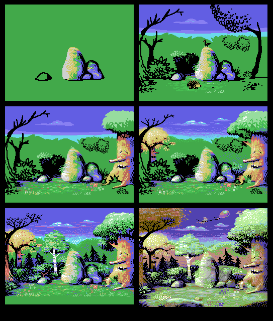
Quoting ZeSmasherpoor little hedgehog, it didn't survive after 2nd phase. r.i.p.
Don't worry, the hedgehog is an overlaid MSX1 sprite (4 sprites really, since MSX1 sprites are quite small and singlecolour only) and simply wandered off to find some tasty sprite worms instead of hanging around waiting for the picture to be completed. It'll be back for the MSX1 release once that's done.
Carrion: That looks great! |
User Comment
Submitted by X-jammer on 18 November 2016
| Vanja! This is crazy good. |
User Comment
Submitted by Roysterini on 18 November 2016
| You should be extremely proud of this one, Vanja. A superb piece of work. |
User Comment
Submitted by psych on 18 November 2016
| Straight 10. More of this please! |
User Comment
Submitted by Yogibear on 18 November 2016
User Comment
Submitted by Thierry on 18 November 2016
User Comment
Submitted by Copyfault on 17 November 2016
It is an absolutely brilliant piece of AFLI-art!
Even if that long-ago fabled UFLI-max-mode would exist, I wonder if this picture could be significantly improved by using the additional sprite colours.
@Mermaid: thank you for being a human MSX-Gfx-Conversion machine ;)) |
User Comment
Submitted by FATFrost on 17 November 2016
| Awesome pixels Mermaid!! I was really happy to see this!! :) |
User Comment
Submitted by Smasher on 17 November 2016
| poor little hedgehog, it didn't survive after 2nd phase. r.i.p. |
User Comment
Submitted by E$G on 17 November 2016
User Comment
Submitted by Linus on 17 November 2016
User Comment
Submitted by Carrion on 17 November 2016
here's first rough versions for c+4.

c+4 can do AFLI the same way C64 can but with all 121 colors. And it wins with greens (for some reason of the 121 colors most of them are green ;) )
again, this is not to improve Mermaid, nor is this a perfect C+4 conversion. I just made it to show you how it could look like on this platform. I'll take more time to convert it more accurately.
I also use Timanthes in this case with C+4 vice pallete. |
User Comment
Submitted by GH on 17 November 2016
User Comment
Submitted by LMan on 17 November 2016
User Comment
Submitted by Mermaid on 17 November 2016
Thanks for the kind feedback, all!
Ptoing: I used Timanthes with the MSX1 palette and the layer properties set to AFLI on every line |
User Comment
Submitted by chatGPZ on 17 November 2016
User Comment
Submitted by Soren on 17 November 2016
| Mermaid you rock so much I can not believe it. :) I was about to vote 12, but the scale only goes to 10. :) |
User Comment
Submitted by saulc12 on 17 November 2016
User Comment
Submitted by ptoing on 17 November 2016
| Nice, always interesting to see steps. What program did you use to make the MSX1 version? |
User Comment
Submitted by Mermaid on 17 November 2016
Carrion: Yes, you're welcome to do a Plus4 version!
I didn't really plan much, just started doodling:

The MSX1 version was drawn a few years ago, the first MSX1 picture I had drawn in over a decade. The empty lines at the top and bottom are reserved for text + a scroller. As always there's stuff I'm not happy about, but at some point I just have to let go and move on to something else. |
User Comment
Submitted by ptoing on 17 November 2016
| Yeah, my mcol stuff has minimal planning around the char borders, but sometimes I move/adjust stuff to finesse something into the chars a bit better. But yeah, it's quite a bit different than AFLI/Hires. |
User Comment
Submitted by Carrion on 17 November 2016
ptoing
I wonder how precise planing Vanja does. In my case I stoped doing this. I mostly work in multicolour and figured out I don't have to plan objects according to char grid. I can always fix it using colors from closest chars. If you know what I mean. But it's not the case with chires (and AFLI) and wanted to hear from Vanja |
User Comment
Submitted by Sixx on 17 November 2016
User Comment
Submitted by ptoing on 17 November 2016
| Yeah, maybe, but with NUFLI you always have the thing with the sprites and nibble stuff, so you might end up with something that is not ideal within what you would do with those colours if you had no weird sprite pixel popping out when you can not hide it behind the foreground nibble colour. So yeah, fuck NUFLI ;) |
User Comment
Submitted by Oswald on 17 November 2016
| maybe nufli would have problems with those alternating lines, but I guess char column boundaries would not be as obvious as they are now. |
User Comment
Submitted by Dr.j on 17 November 2016
| simply gorgeous art! one of the best pictures i have seen in a long while. a lot of goodies in one picture |
User Comment
Submitted by ptoing on 17 November 2016
| Carrion, I would bet money that Mermaid laid out certain elements to coincide with the char borders, it's just good practise to do so on C64 in general, but in hires and afli in particular. |
User Comment
Submitted by TMA on 17 November 2016
User Comment
Submitted by grip on 17 November 2016
User Comment
Submitted by Shine on 17 November 2016
| Ohhh Vanja ... you are so numinous!!! Extraordinary scene! I love this so much ... <3 |
User Comment
Submitted by Cruzer on 17 November 2016
| We need the fabled NUFLI-Max with 6 sprites and FLI every line. :) |
User Comment
Submitted by Carrion on 17 November 2016
ptoing
plus in nufli you can't do (easily) Pal blended colors. something I like to do and wasn't able to achieve it in nufli.
i keep analyzing this pic and it keeps amazing me how well done is it. I wonder if some parts of it were planned to meet the char 8x1 boundaries or they just happened by accident. |
User Comment
Submitted by ptoing on 17 November 2016
| I am pretty sure that this would look significantly worse in NUFLI in a lot of places (what with afli every 2 lines and the weird sprite bleed stuff). Deekay, if you read this, feel free to proof me wrong :D |
User Comment
Submitted by Oswald on 17 November 2016
| brilliant ! but why not nufli ? ( ;-) ) |
User Comment
Submitted by Fredrik on 17 November 2016
User Comment
Submitted by Zer0-X on 17 November 2016
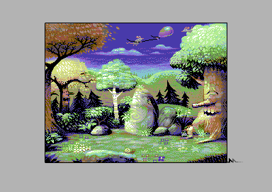
| I like how the tree at left seems to be burping. Just lacks the Simpsony wavy lips animation of Barney. |
User Comment
Submitted by Cruzer on 17 November 2016
| Had to check that d015 was 0 since I simply couldn't believe this was pure AFLI. |
User Comment
Submitted by G-Force on 17 November 2016
| Superb stuff reminds me of simon the sorcerer.(:-) |
User Comment
Submitted by Mr. SID on 17 November 2016
| Excellent. The screenshot doesn't do it justice, because it lacks the PAL blending. |
User Comment
Submitted by Isildur on 17 November 2016
User Comment
Submitted by Carrion on 17 November 2016
I'm speechless.
Wow /o\ AFLI
Mermaid, if you don't mind I'll try to do C+4 version just to see how it could look on this platform |
User Comment
Submitted by Peacemaker on 17 November 2016
User Comment
Submitted by Bitbreaker on 17 November 2016
| The right tree that is so dense packed with colors and the green plants in the backgrounds, where each leaf casts shadows on each other (so much great effect from so few colors) make this pic so brilliant. The flowers that all face the viewer are not so much my taste though. |
User Comment
Submitted by hedning on 17 November 2016
| Wow. Just wow. Excellent! |
User Comment
Submitted by Pad on 17 November 2016
User Comment
Submitted by HCL on 17 November 2016
| Omg!! So beautiful, and painted in A-FLI.. the choice for those who really want to get into trouble :) Perhaps the best pic i've ever seen in A-FLI. |
User Comment
Submitted by Dymo on 17 November 2016
User Comment
Submitted by zscs on 17 November 2016
| So beautiful! Cute:) 10/10 |
User Comment
Submitted by fenz on 17 November 2016
| Love the style, atmosphere, and use of colors. Well done. |
User Comment
Submitted by Jazzcat on 17 November 2016
Beautiful. Love the colours here.
Back left tree seems a bit flat in the leaf foliage. A lovely place for a picnic! |
User Comment
Submitted by Joe on 17 November 2016
User Comment
Submitted by ptoing on 17 November 2016
| Great up-cycling :D Lovely picture. |
User Comment
Submitted by Mermaid on 17 November 2016
| Evolved from an MSX-1 picture that I made a few years ago. |
|
|
|
 | Search CSDb |
 |
|
 | Navigate |  |
|
 | Detailed Info |  |
|
 | Fun Stuff |  |
· Goofs
· Hidden Parts
· Trivia
|
|
 | Forum |  |
|
 | Support CSDb |  |
|
 |  |
|


